
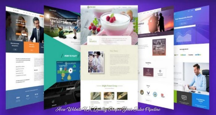
How Website UX Quietly Shapes Your Sales Pipeline
Most businesses treat their website and their sales process as two separate operations. The marketing team handles the site; the sales team works the phones and inbox. But the gap between a high-performing sales pipeline and a mediocre one often starts well before any salesperson picks up the phone. It starts on your website, in the seconds between a visitor landing on your page and deciding whether to fill out a form, click away, or keep scrolling.
Companies that recognize this connection tend to make smarter investments on both sides. Some redesign their sites around buyer intent. Others shift their prospecting efforts entirely by outsourcing lead generation to specialists so their internal teams can focus on closing deals that the website helped warm up. Either way, the website becomes less of a brochure and more of a qualifying tool.
What Visitors Actually Do in the First Eight Seconds

The eight-second stat gets thrown around a lot, but what matters more is what happens during those seconds. Eye-tracking studies consistently show that visitors scan in an F-pattern: across the top, down the left side, and across again at the first subheading. If your value proposition sits below the fold or buried in a paragraph, most people never see it.
A SaaS company in Austin ran heat maps on their homepage for six weeks and found that 72% of visitors never scrolled past the hero section. Their contact form sat at the bottom of the page. Moving it to the right sidebar of the hero section increased form submissions by 38% without changing a single word of copy.
The distinction here matters: design aesthetics and design function are not the same thing. A visually striking site can still fail if its layout doesn’t match how people actually read screens.
Form Design Is Where Most Leads Die

Contact forms are deceptively simple. Name, email, message, submit. But every additional field you add reduces completion rates. Research published by the Baymard Institute found that the average checkout form contains 11.3 fields, nearly twice as many as necessary for most transactions. The same principle applies to lead capture forms.
There’s a practical tradeoff here. Fewer fields mean more submissions but lower lead quality. More fields filter out casual browsers but shrink your pipeline. The best approach depends on your sales model. If your team can handle volume and qualify quickly, keep it short. If each sales conversation requires heavy preparation, use conditional logic to gather more detail upfront.
One pattern that works well for mid-market B2B companies is the two-step form: a short initial capture (name, email, company) followed by an optional second page with qualifying questions. People who complete both steps tend to convert at significantly higher rates during sales calls.
Page Speed and Its Direct Effect on Pipeline Volume

Google’s own data shows that as page load time goes from 1 second to 3 seconds, the probability of a visitor bouncing increases by 32%. At 5 seconds, that number jumps to 90%. For lead generation sites, every second of delay shrinks the top of the funnel.
The fix is rarely dramatic. Compressing images, deferring non-critical JavaScript, and switching to a faster hosting provider can shave 2 to 3 seconds off load time. A legal services firm in Chicago did exactly this and saw their monthly lead volume increase by 22% over the following quarter, with no changes to their advertising spend.
Mobile Experience as a Trust Signal
About 60% of B2B research starts on mobile devices, according to data from Google’s B2B research studies. Yet many B2B websites still treat mobile as an afterthought. Buttons are too small to tap accurately, forms require horizontal scrolling, and key information hides behind hamburger menus that nobody opens.
Mobile UX is also a trust signal. When a visitor hits a site that looks broken or difficult to use on their phone, they make a judgment about the company behind it. A staffing agency that can’t get its own website right doesn’t inspire confidence in its ability to manage complex client relationships.
The practical fix isn’t a full mobile redesign. Start with the pages that receive the most traffic from mobile devices and ensure the primary call-to-action is visible without scrolling. Test forms on at least three different phone models. These small adjustments often have outsized effects on conversion.
When Design Changes Stop Working

There’s a ceiling to what UX optimization alone can achieve. You can have the fastest, cleanest, most persuasive website in your industry and still hit a wall if your traffic quality is poor or your follow-up process is slow. Design gets people to raise their hand. Everything after that depends on your sales infrastructure.
This is where companies get honest about capacity. Internal teams stretched across prospecting, qualifying, and closing can’t do all three well simultaneously. The website might generate 200 leads a month, but if only 40 get a timely follow-up, the other 160 might as well never have visited. I’ve seen this play out with companies that obsess over conversion rate optimization while ignoring the fact that their average response time to a new inquiry is 28 hours.
The smart move is matching your website’s lead capacity to your team’s actual bandwidth. If there’s a gap, fix the bottleneck before pouring more into design iterations.